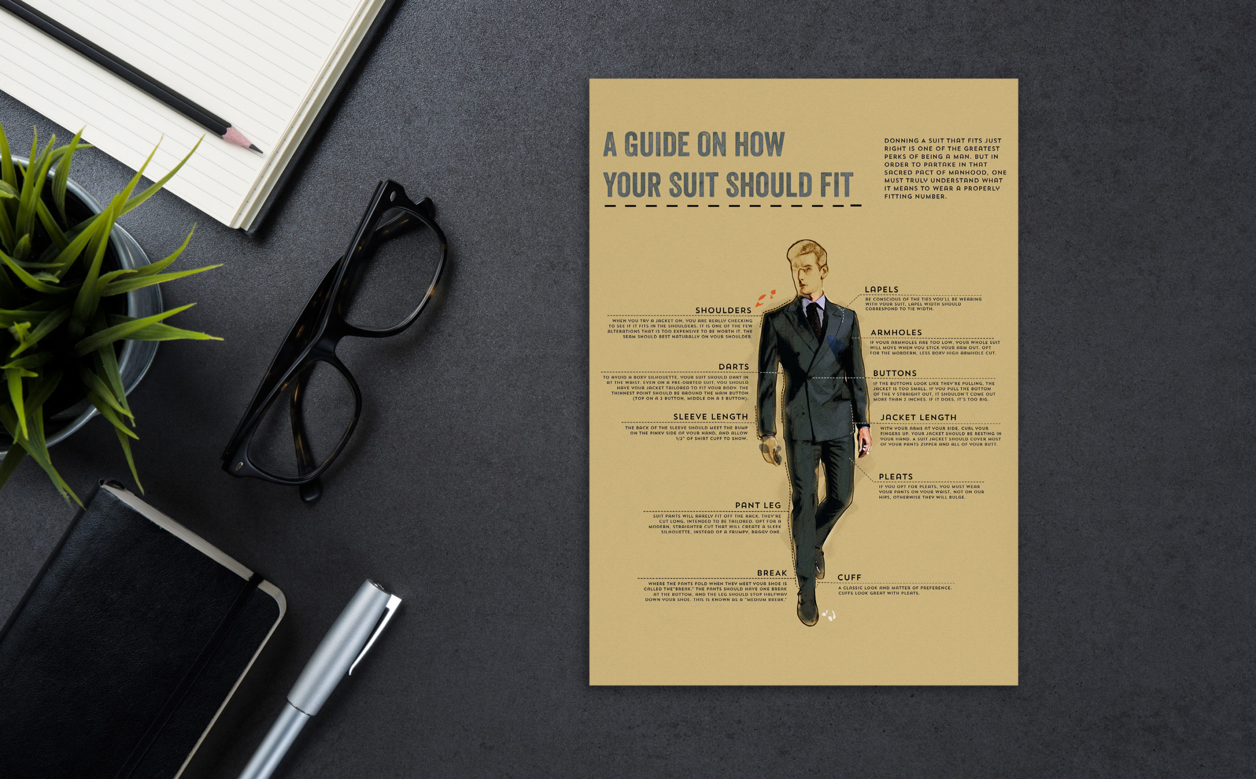
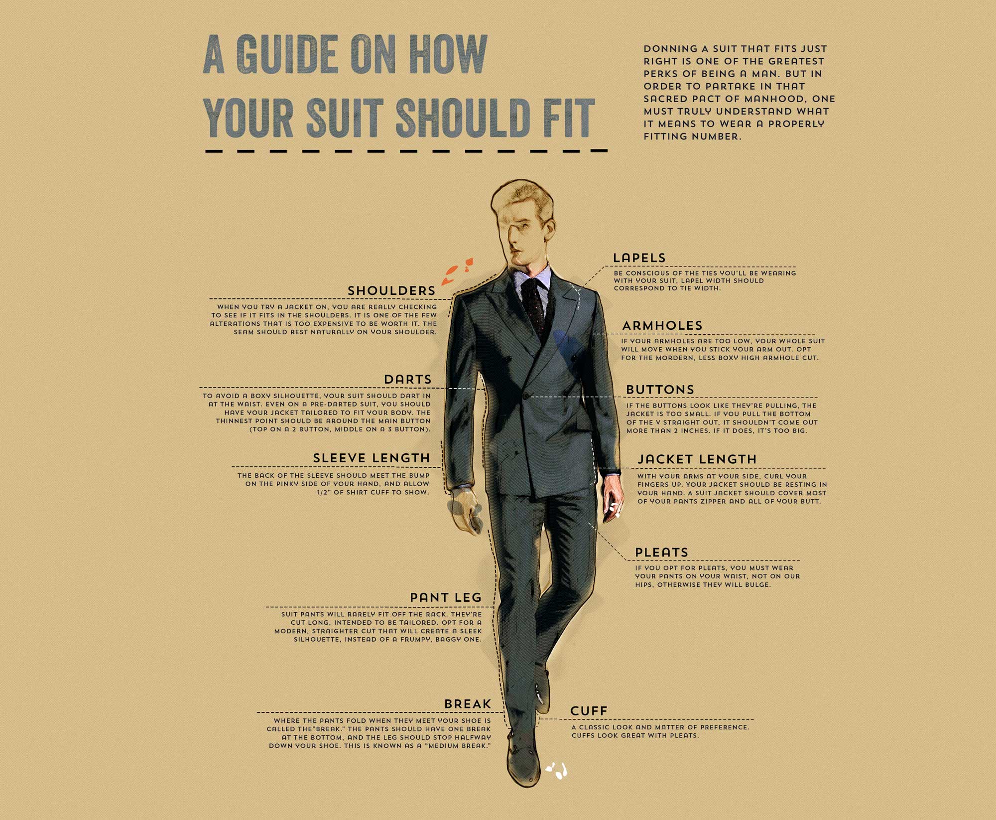
How Your Suit Should Fit Infographic
I was assigned by Creative Invites and Events to create an infographic for one of their long-time Vendors, Folchi's Men's Warehouse, about How Your Suit Should Fit. They wanted something simple, easily readable, and creative. One such design aesthetic used in this infographic was the dashed lines to represent as the stitches in the suit. I also used this modern Art Deco font.


